Mastering Device Analytics: A List of Common Screen Sizes
Discover the most common screen sizes in 2026 and learn how to use lihi’s advanced analytics to optimize your marketing campaigns for mobile, tablet, and desktop users.
Ultimate Guide to Screen Sizes: Optimizing Your Links for Every Device
In an era where users switch between smartwatches, foldable phones, and ultra-wide monitors, “one size fits all” is a recipe for high bounce rates. If your links aren’t optimized for the screen your audience is holding, you’re leaving money on the table.
Understanding screen sizes isn’t just for designers it’s a critical skill for modern marketers. By leveraging lihi, you can transform these technical dimensions into actionable insights.
Why Screen Size Matters for Your Click-Through Rate (CTR)
Every pixel counts. When a user clicks your shortened link, their device’s screen size determines how your content is rendered. A call-to-action (CTA) button that looks perfect on a desktop might be completely buried on a mobile device.
[Internal Link: How to use lihi for A/B Testing]
Common Screen Sizes in 2026: A Quick Snapshot
Before you launch your next campaign, keep these standard resolutions in mind:
- Mobile: 390×844 (common iPhone standard) to 412×915 (Android flagship).
- Tablet: 768×1024 (iPad Portrait) to 1366×1024 (iPad Pro).
- Desktop: 1920×1080 (Full HD) remains the gold standard, though 2K and 4K are rising.
- Mastering Social Media Assets (2026 Standards)
- When your lihi links lead to social media platforms, resolution is only half the battle. You must account for UI Occlusion Zones—areas where usernames, captions, or action buttons hide your content.
- The “Safe Zone” Secret for High Conversion
- To ensure your key message or CTA isn’t blocked, keep your content within these “Safe Zones”:
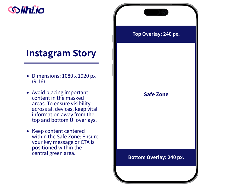
- Instagram Stories (9:16): Total size 1080 x 1920 px. Avoid placing text in the top 240 px and bottom 240 px.
- Instagram Reels (9:16): Total size 1080 x 1920 px. This has a stricter safe zone due to the interface. Avoid the top 240 px and the bottom 400 px.
- Pro Tip: Leave a 40 px margin on all sides to prevent iPhone-specific auto-cropping.
- Length: Aim for 3 to 90 seconds for optimal performance.
- Portrait Feed Posts (4:5): Total size 1080 x 1350 px.
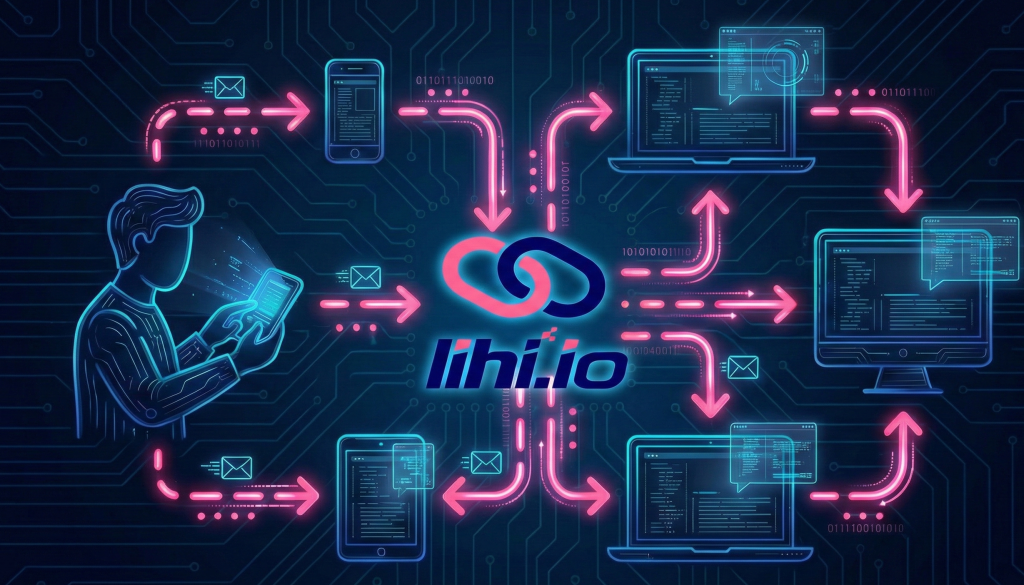
How to Track Device Data Using lihi
lihi does more than just shorten URLs; it acts as an analytics hub. Here is how you can master device analytics:
1. Shorten Your Link with lihi
Paste your long URL into the lihi dashboard. Customize your slug to ensure your audience knows exactly where they are going.
2. Monitor Real-Time Analytics
Once your link is live, visit your dashboard. lihi provides a granular breakdown of your traffic sources.
- Identify the Device: See if your audience is primarily on mobile or desktop.
- Analyze Resolution: Understand the screen sizes interacting with your content.
3. Adjust Your Strategy
If 80% of your clicks come from mobile devices with small screens, simplify your landing page immediately.
Want to see how these resolutions are shifting in real time? Check global screen size trends on StatCounter .
Best Practices for Cross-Device Optimization
Test Your Links: Always preview your lihi links on at least three different screen sizes before a major blast.
Keep it Finger-Friendly: Ensure buttons are at least 44×44 pixels for mobile users.
Shorten Everything: Use lihi to keep your links clean, especially on small screens where long URLs look cluttered.
| Category / Platform | Resolution (px) | Ratio | Safe Zone & Design Notes |
|---|---|---|---|
| 📱 Social Media (Instagram 2026 Standards) | |||
| Reels / Stories / Live | 1080 × 1920 | 9:16 | Safe Zone 1080 x 1280. Avoid top 240px & bottom 400px. |
| Portrait Post | 1080 × 1350 | 4:5 | Safe Zone 1015 x 1350. Avoid side 32.5px. |
| Landscape Post | 1080 × 608 | 16:9 | Ideal for cinematic or wide photography. |
| Square Post | 1080 × 1080 | 1:1 | Standard feed format. |
| Tablets & iPads | |||
| iPad Pro 12.9″ | 1024 × 1366 | 3:4 | Largest tablet viewport for high-end creative work. |
| iPad mini / Standard | 768 × 1024 | 3:4 | Classic iPad portrait viewport; highly common. |
| Android Tablet | 800 × 1280 | 10:16 | Typical resolution for mainstream Android tablets. |
| 💻 Desktop & Laptops | |||
| Full HD | 1920 × 1080 | 16:9 | The global standard for most monitors. |
| QHD / 2K | 2560 × 1440 | 16:9 | High-end displays and premium laptops. |
| 📱 Mobile Viewports | |||
| iPhone Pro Series | 390 × 844 | 19.5:9 | Standard iOS logical viewport. |
| Android Flagship | 360 × 800 | 20:9 | Common viewport for Samsung and Pixel devices. |
Stop Guessing, Start Optimizing
Understanding screen sizes is a great first step, but data without action is just a spreadsheet. In 2026, the brands that win are the ones that know exactly who their audience is and what device they are holding.
lihi doesn’t just shorten your links; it provides a high-definition window into your audience’s behavior. Instead of wondering if your landing page looks good on an iPhone 16 Pro, you can see the data in real-time and adjust your strategy before your budget runs out.
Ready to see your links in a new dimension?
Join smart marketers who use lihi to bridge the gap between a click and a conversion. It takes less than 60 seconds to set up, and it lasts the long-term insights the insights.
[👉 Create Your Free lihi Account Now]
Start using lihi for free
Join thousands of marketers and optimize your links today.